Our Award-Winning Products


Pürsu
2020 Crescents and Stars for Packaging Golden Award | 2021 Worldstar Winner | 2021 Design Turkey | 2022 AsiaStar Awards
The unique use of different snowflakes on the water bottle symbolizes the quality and uniqueness of Pürsu. Nature's miraculous motifs are key design elements. The design reaches its final form with a modern and minimal aesthetic, in line with its label.
Mehmet Güzel - Pürsu Marketing Director
The effort of the GCA design team to understand us was really distinctive. The design suggestions they brought to Pürsu by understanding our brand made our work easy. Pürsu is a brand built on the uniqueness of people, and the GCA team's suggestion to print a different snowflake engraving on each bottle was a perfect design idea for our brand.

Abant Su
2020 Crescents and Stars for Packaging Bronze Award
Inspired by the organic form of a water droplet, the Abant Water Bottle is designed to portray qualities that express plainness, purity, rarity, and simplicity. A strong example of modern design with its minimal elegance, the Abant Su water bottle provides production efficiency due to its innovative design.
"We believe that the design we created through our collaboration with GCA will increase our prominence in the glass bottle market and bring a new perspective with its innovative design.
Erhan Yıldırım - Factory Manager at Abant Su

Taşkesti Su
2020 Crescent and Stars of Packaging Bronze Award
Inspired by the roe deer figure that is identified with Bolu, a region that's a major source of water, the design of the Taşkesti Water Bottle emphasizes the crystallized structure of water, the peaks of the Bolu Mountain, alongside the nature and the feeling of spaciousness that comes with it.
“The GCA family encouraged us to have a distinctive and unique design for our new bottle. They genuinely listened to us and cared about our brand story. The result was a beautiful and ergonomic design.”
Mehmet Ali Özal
Chairman of the Board of Taşkesti
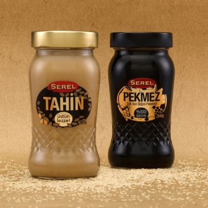
Serel Tahin-Pekmez
2020 Crescents and Stars for Packaging Perfection Award
The new packaging of Serel crowns the tahini and molasses duo, whose place in Turkish culture is indisputable. Tahini-molasses' granular structure inspires the design, which predominantly portrays organic forms and displays an aesthetic close to our traditional values, presenting warm and sincere energy.
"We value your ability to reflect the product's intended reception during the design process and expedited project implementation process."
Mehmet KARA - BİM Purchasing Manager
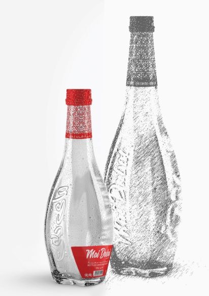
Mai Dubai
2019 Reddot Design Award Winner | 2020 Silver A' Design Award Winner
A bottle design with a premium effect, Mai Dubai Water is inspired by the Dubai Infinity Tower, one of our times' most modern and original architectural structures. The twisted body, which resembles its source of inspiration, is compact and extremely ergonomic in its users' grip. The traditional oriental Arabic cultural motifs in its red label is a strong statement for innovative design. The design can be summed up as strong, bold, elegant, passionate, and desirable.

Bahçeden Reçel
2018 Crescents and Stars for Packaging Golden Award
Containers redesigned for Bahçeden Jam products signify picking fruits and vegetables from the garden in the most natural way, as the brand name suggests. In line with the concept, decorative vegetable patterns are used as the main design feature. The decorative forms have different effects depending on the product, which showcases the flavor diversity perfectly.
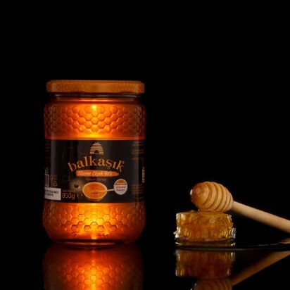
Balkaşık Bal
2018 Crescents and Stars for Packaging Bronze Award
Balkaşık Honey products used to be packaged in standard glass jars. Their new packaging design revamped the old look with a honeycomb-shaped texture while maintaining the former dimensions and weight. The new packaging combines ergonomic and aesthetic values in a cost-effective package. The use of nature's most efficient design form, the honeycomb, on the packaging correlates the packaging and the product and elevates the aesthetic.
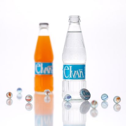
Elvan Gazoz
2018 Crescents and Stars for Packaging Perfection Award
The bottle of Elvan Gazoz, an essential drink in the 70s and 80s, is brought back with a design that adopts an exaggerated take on Elvan's logo as the main feature. With the sense of nostalgia and freshness preserved, the design also integrates contrast. The design is feminine and masculine and round and edgy at the same time. Almost like saying it's timeless and for everyone.
"Elvan Gazoz was a major project for us and all of our stakeholders. That's why we chose to work with GCA to design our bottle; we knew they would care about the project as much as we do. They understood our expectations, and we came up with a design and product that is aesthetically pleasing and easy to consume thanks to its ergonomic design. We thank them for transforming our excitement and belief in Elvan Gazoz into this bottle."
Elvan Group
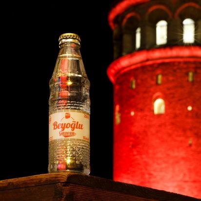
Beyoğlu Gazozu
2017 Red Dot Design Award Winner
With its historical texture and rich cultural background, Beyoğlu is among the oldest gems of our history, and the Galata Tower is one of its stunning symbols. The design inspiration was already clear for the Beyoğlu brand. Choosing the Galata Tower to symbolize the brand also added a taste-enhancing touch to the soda. Golden cap as an homage to the past and the label design with the Taksim tram presents the nostalgic aura of Istanbul.


